King Kong
Summary
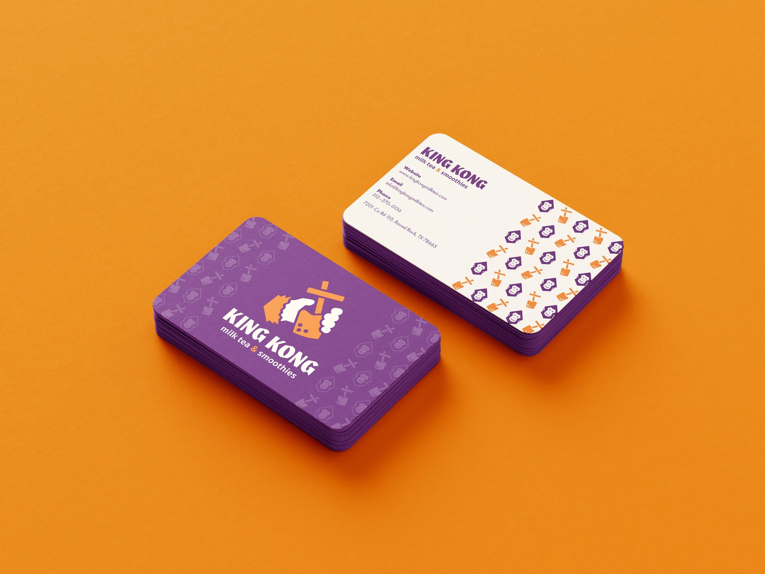
King Kong Milk Tea & Smoothies is a bubble tea and street food café. The goal of this project was to update the brand’s identity so it feels more current and aligns with its young, urban audience. Founded in July 2016, the café serves milk teas, fruit teas, smoothies, coffee, and customizable street food. Simplifying the logo and adding a friendly, happy monkey mascot gives the brand a creative, approachable, and fun identity that matches its mission of offering unique, high-quality beverages in a welcoming environment.
Project Type
Branding
Deliverables
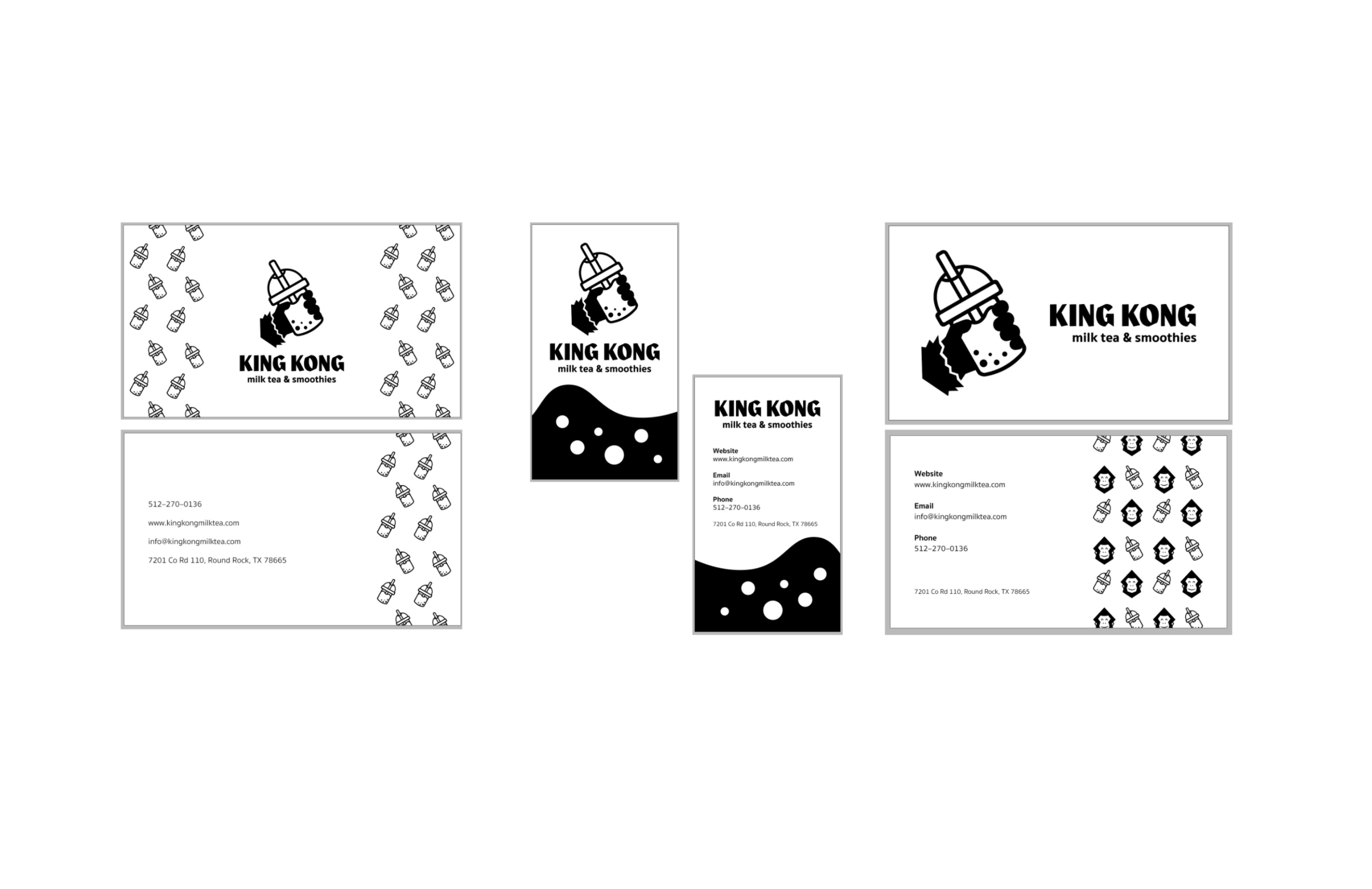
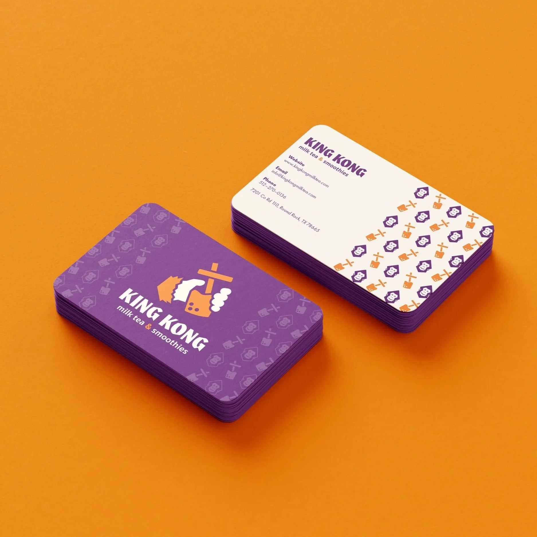
Logo, Business Cards, Food Truck, Stickers.
Tools
Illustrator, Photoshop, Procreate
Discover & old Logo
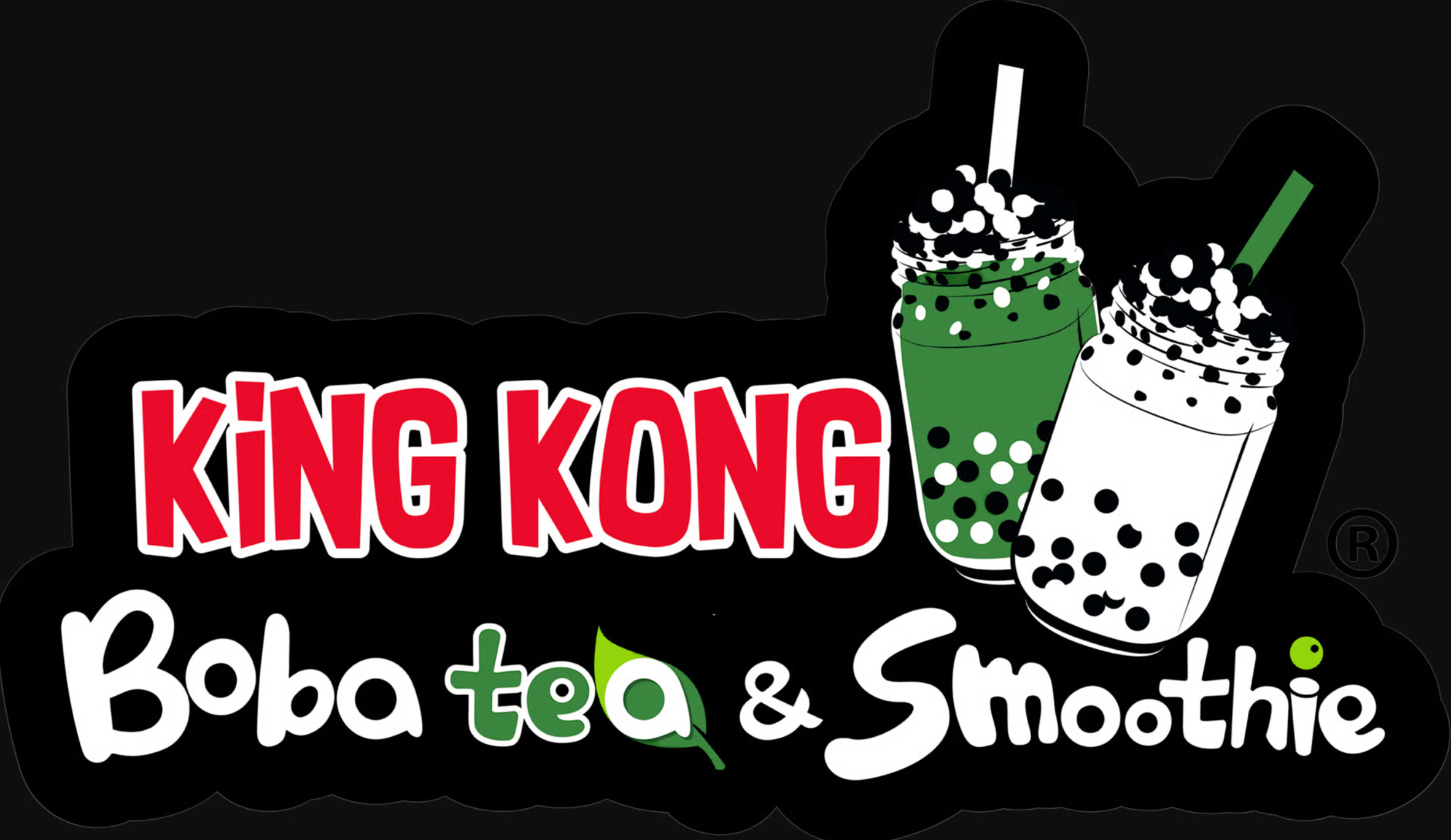
Old Logo 2023
Target Audience
King Kong Milk Tea & Smoothies primarily serves teens and young adults, slightly more female, who are students or early-career professionals. They live in urban or suburban areas and enjoy socializing, trends, and visually appealing experiences. Customers are drawn to places that feel friendly and fun, and they value the ability to customize their drinks and try unique flavor combinations.
Brand Image
The brand aims to feel approachable, creative, and modern while staying playful. By simplifying the logo and incorporating a cheerful monkey mascot, the identity communicates friendliness and uniqueness. The goal is to make the café stand out from competitors, signaling high-quality, innovative drinks in a welcoming, social environment.
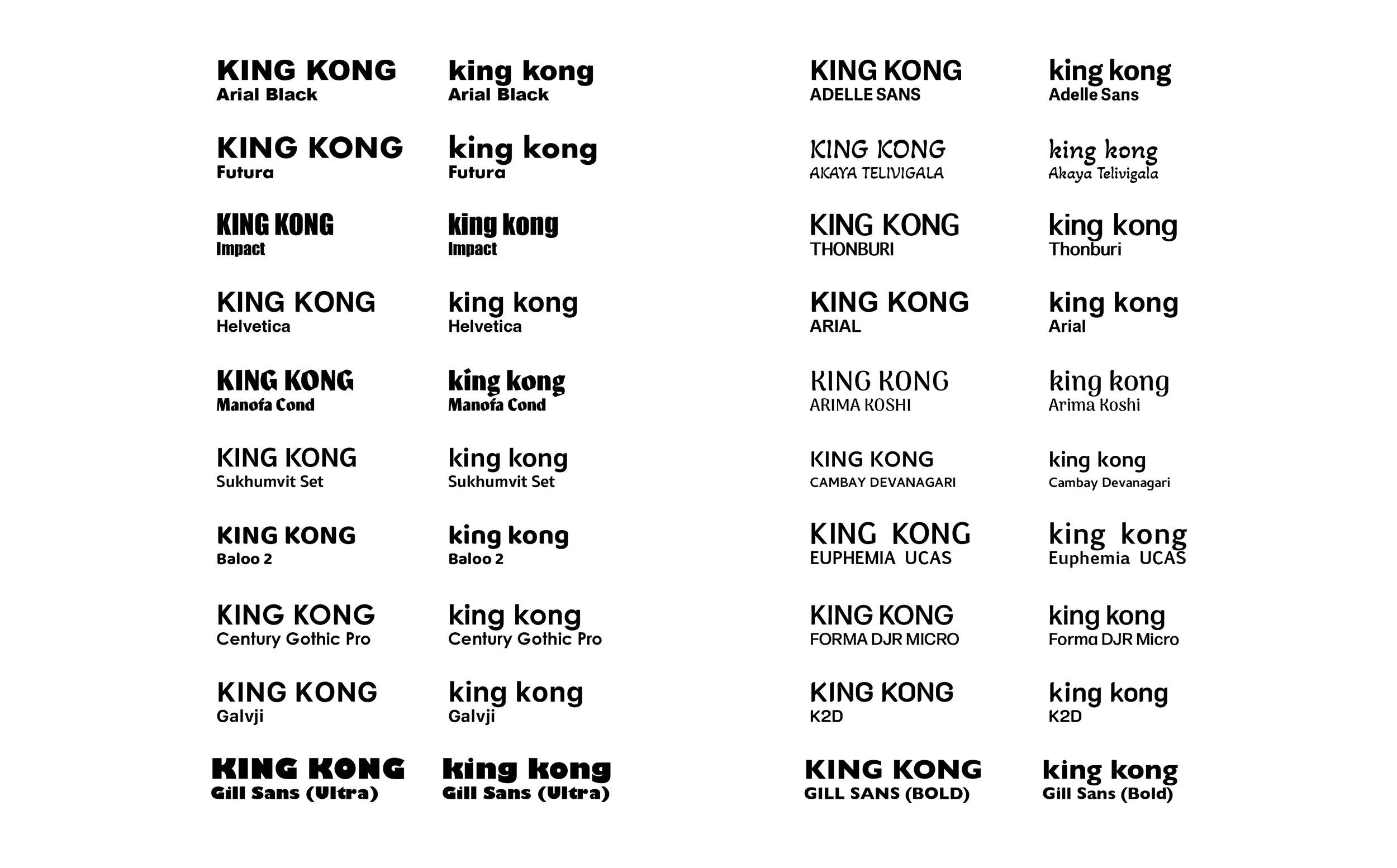
Sketches & Development
Logo & Color
Visual Identity Overview
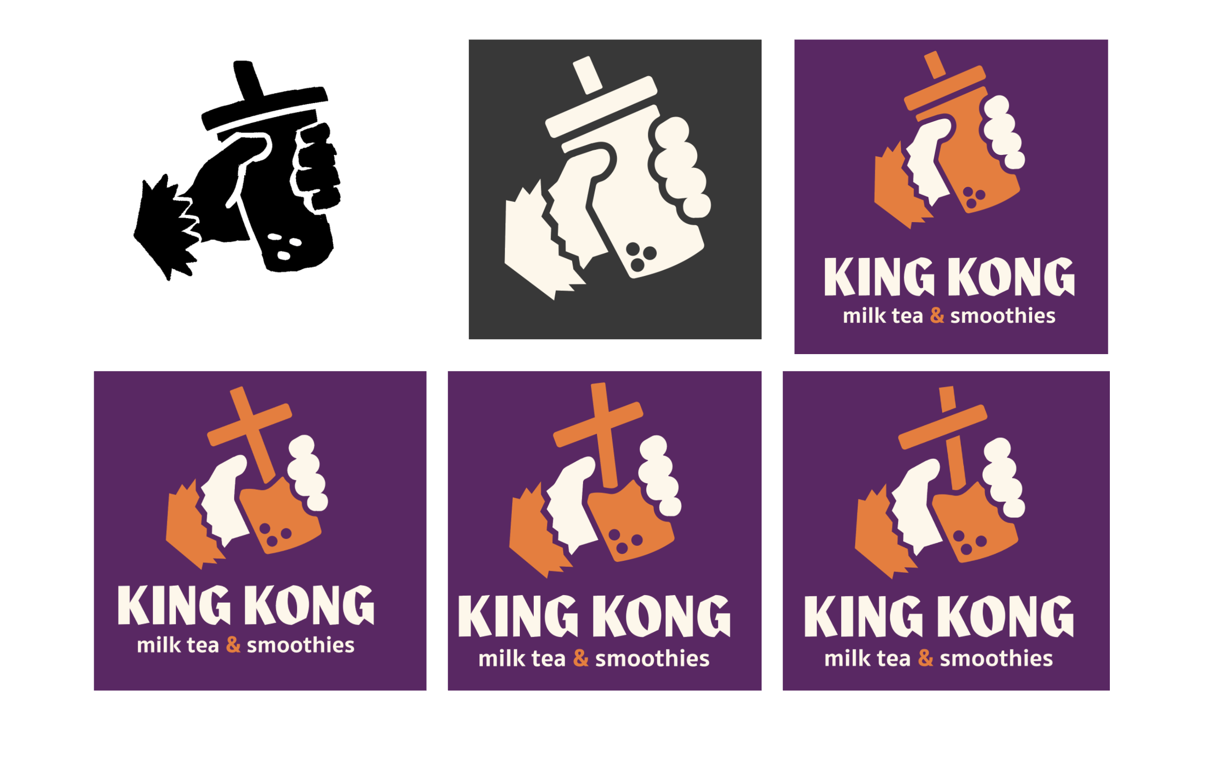
The logo features a monkey’s hand holding a cup of boba, creating a fun symbol for the brand. Multiple lockups were designed to ensure versatility across different applications, from food trucks to cups. The color palette adds a playful, vibrant feel while remaining cohesive throughout the visual identity.



Lessons Learned
Designing for Versatility
One of the main takeaways from this project was learning how important it is for a logo to work across a variety of contexts. I created multiple lockups of the monkey holding the boba cup so the brand could adapt to different formats, from social media icons to storefront signage and menu designs. This process reinforced that a strong visual identity isn’t just about looking good in one place; it needs to maintain clarity, personality, and impact no matter where it appears.

