
Sedona Arizona
Summary
This project focuses on creating a visual identity for Sedona, Arizona, that balances adventure and tranquility. The branding highlights the city’s vibrant red rock landscape, outdoor experiences, and reputation as a wellness destination. Warm, earthy colors and organic typography reflect both the boldness of the terrain and the calming, restorative side of Sedona. The overall goal is to communicate Sedona as a place where visitors can escape daily stress, explore freely, and reconnect with nature.
Project Type
City Branding
Deliverables
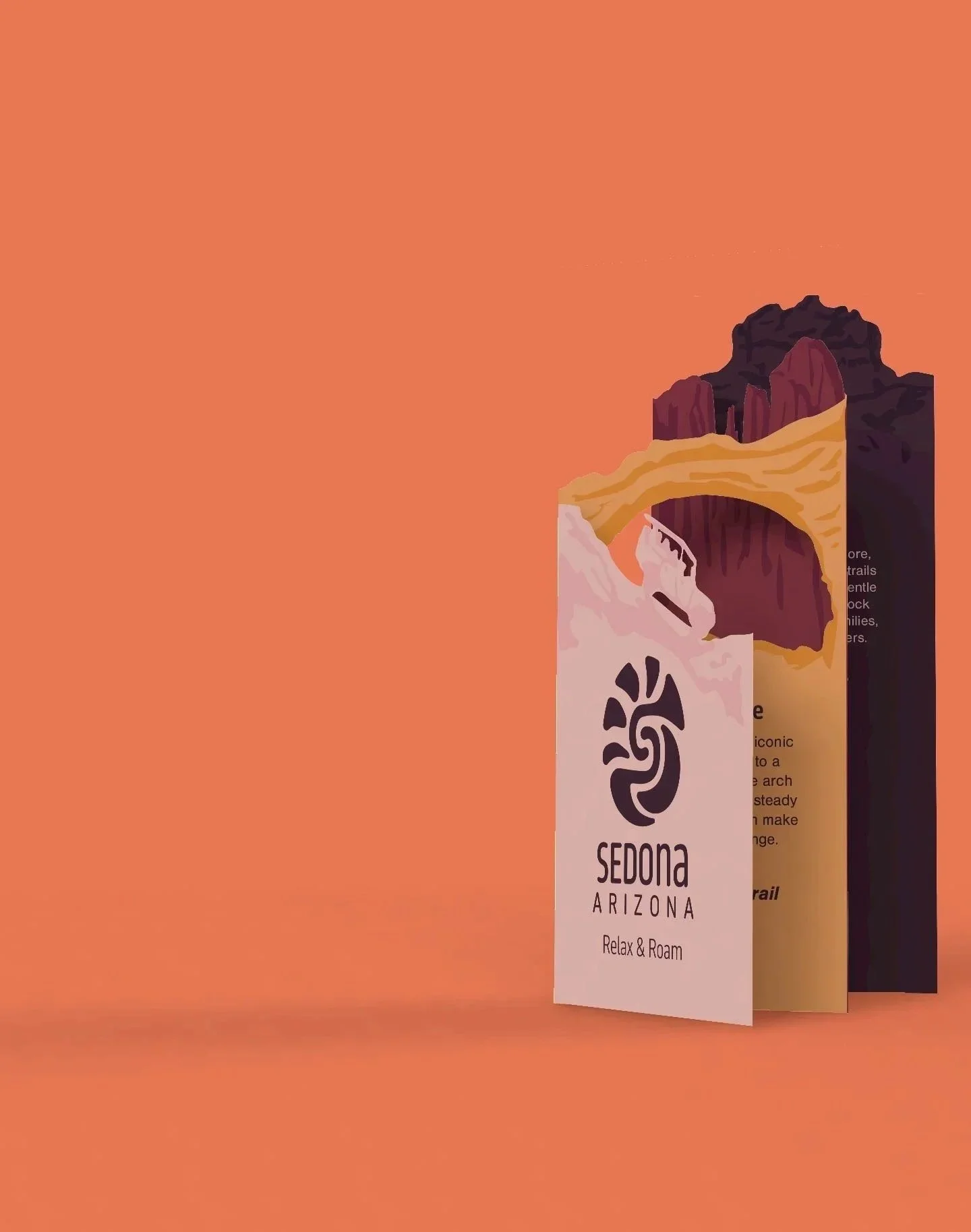
Logo, Brochure, Billboard, Way-finding,
Shirts, Water bottle.
Tools
Illustrator, Photoshop, Procreate, Dimension
Discovery & Mood Board

Target Audience
This campaign is designed for travelers ages 25 to 40 seeking a destination that offers both outdoor adventure and a sense of calm. They tend to be health conscious, active, and willing to spend on meaningful experiences. Many come from busy urban areas and want a trip that lets them step away from routine, recharge, and reconnect with nature. Sedona appeals to them because it offers hikes, views, and wellness experiences that feel refreshing rather than overwhelming.
Concept & Image
The visual direction focuses on balancing adventure with serenity, reflecting Sedona’s mix of striking red rock formations and peaceful, spiritual energy. Warm, vibrant colors echo the natural landscape, while organic typography reinforces the sense of calm and nature-focused exploration. Elements inspired by topography and natural layering support the idea of discovering Sedona at your own pace, moving from energetic outdoor activities to quiet moments of reflection.
Sketches & Development


Challenge & Solution
Challenge
The biggest challenge at the start was figuring out how to visually separate Sedona from other places in Arizona. My first instinct was to focus on the red rocks, but that quickly began to feel generic since many nearby locations share similar landscapes. I needed something more distinct and meaningful to represent the city.
Solution
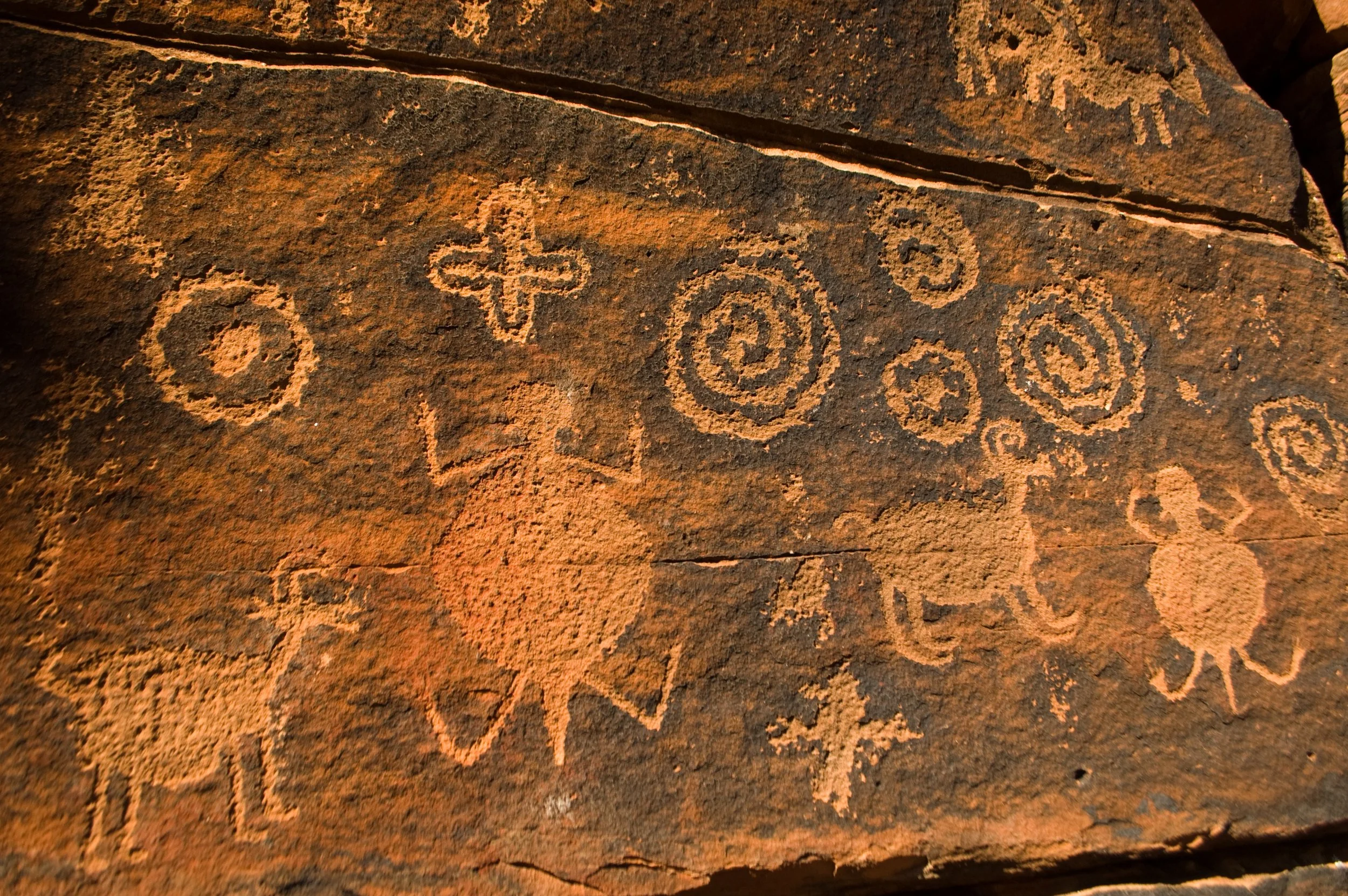
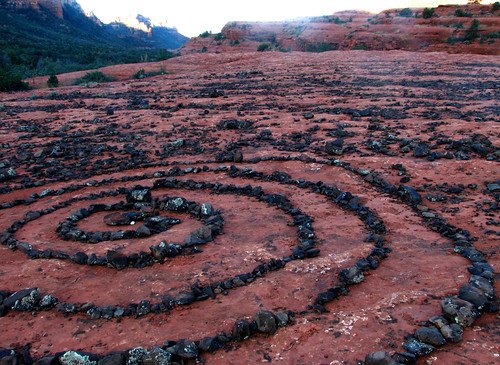
Digging deeper into research led me to Sedona’s reputation as a spiritual destination known for its energy vortexes. That opened the door to exploring spiral imagery, both in how visitors arrange rocks and in some of the petroglyph motifs found in the area. While the exact meanings of those markings aren’t certain, the repeated spiral forms inspired a direction that felt unique to Sedona. Focusing the logo around this shape helped me create an identity that stands apart while still feeling true to the place.

Logo Breakdown
Vortex Symbole
The spiral comes from Sedona’s energy vortexes and also forms a subtle “S” for the city. It gives the logo a simple visual anchor that ties directly to what makes Sedona unique.
Sun & Moon
The sun represents daytime activities like hiking and exploring the red rocks. The moon highlights Sedona’s calmer side, including its spiritual atmosphere and clear night skies. Together they show the two sides of visiting Sedona.
Color Palette
The colors come from the layers of Sedona’s red rock formations. They’re slightly muted to keep the palette natural and calm, fitting the landscape and overall mood of the city.


Lessons Learned
Finding What Sets the Brand Apart
One of the biggest takeaways from this project was learning how important it is to identify what truly sets a place or brand apart. At first, Sedona felt hard to differentiate from other Arizona destinations, but digging deeper into its vortexes and spiritual atmosphere helped me build a clearer direction. It showed me that strong branding starts with finding that one defining element and letting it guide the rest of the design.
Broadening My View of Sedona
When I first visited Sedona, my experience was centered on hiking, exploring, and outdoor adventure. I didn’t initially recognize its strong spiritual reputation. Through deeper research and listening to how others described the city, I gained a clearer picture of what Sedona represents to many people. This reminded me how important it is to look beyond personal experiences and consider a broader range of perspectives when shaping a brand story.