Top Tier Sandwiches
Summary
This brand is built around the idea of tall sandwiches stacked to impressive heights. The goal was to create a visual identity that captures a playful, family-friendly personality while clearly emphasizing the “tall sandwich” concept. Vibrant colors, energetic typography, and a friendly giraffe mascot come together to signal height and humor—resulting in a bold, memorable, and cohesive identity system.
Project Type
Branding
Deliverables
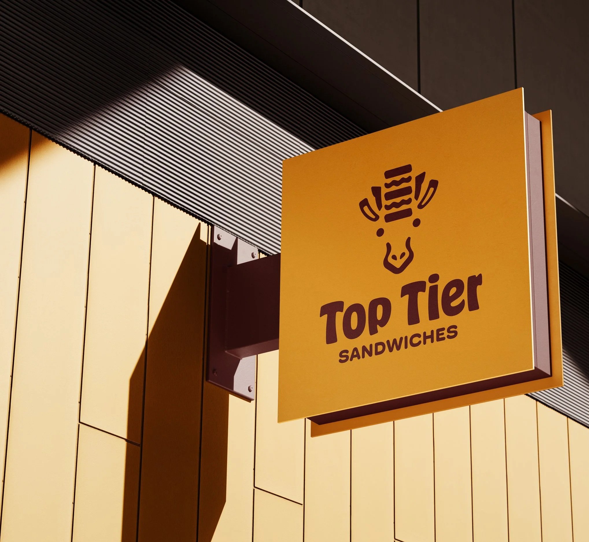
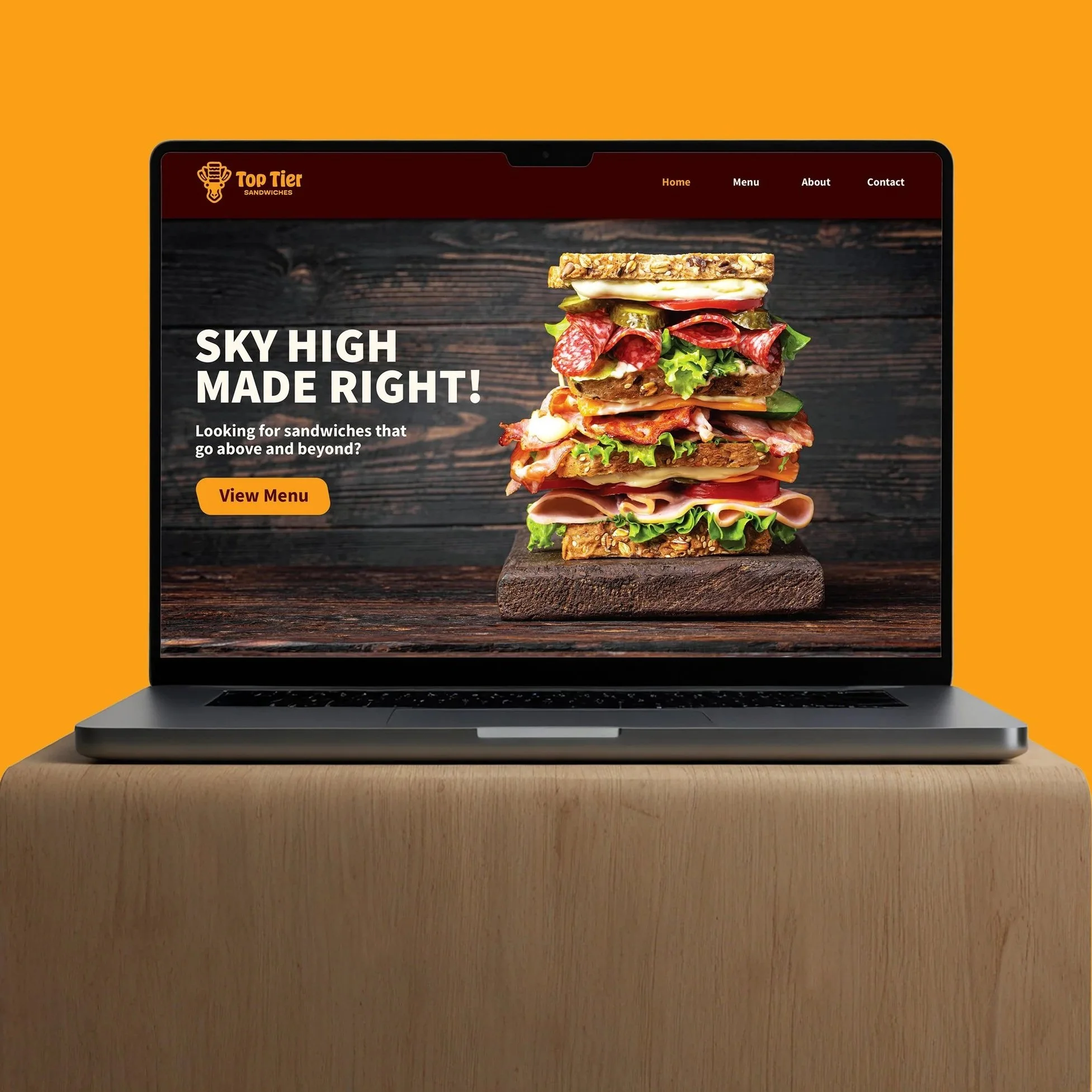
Logo, business cards, Home page hero,
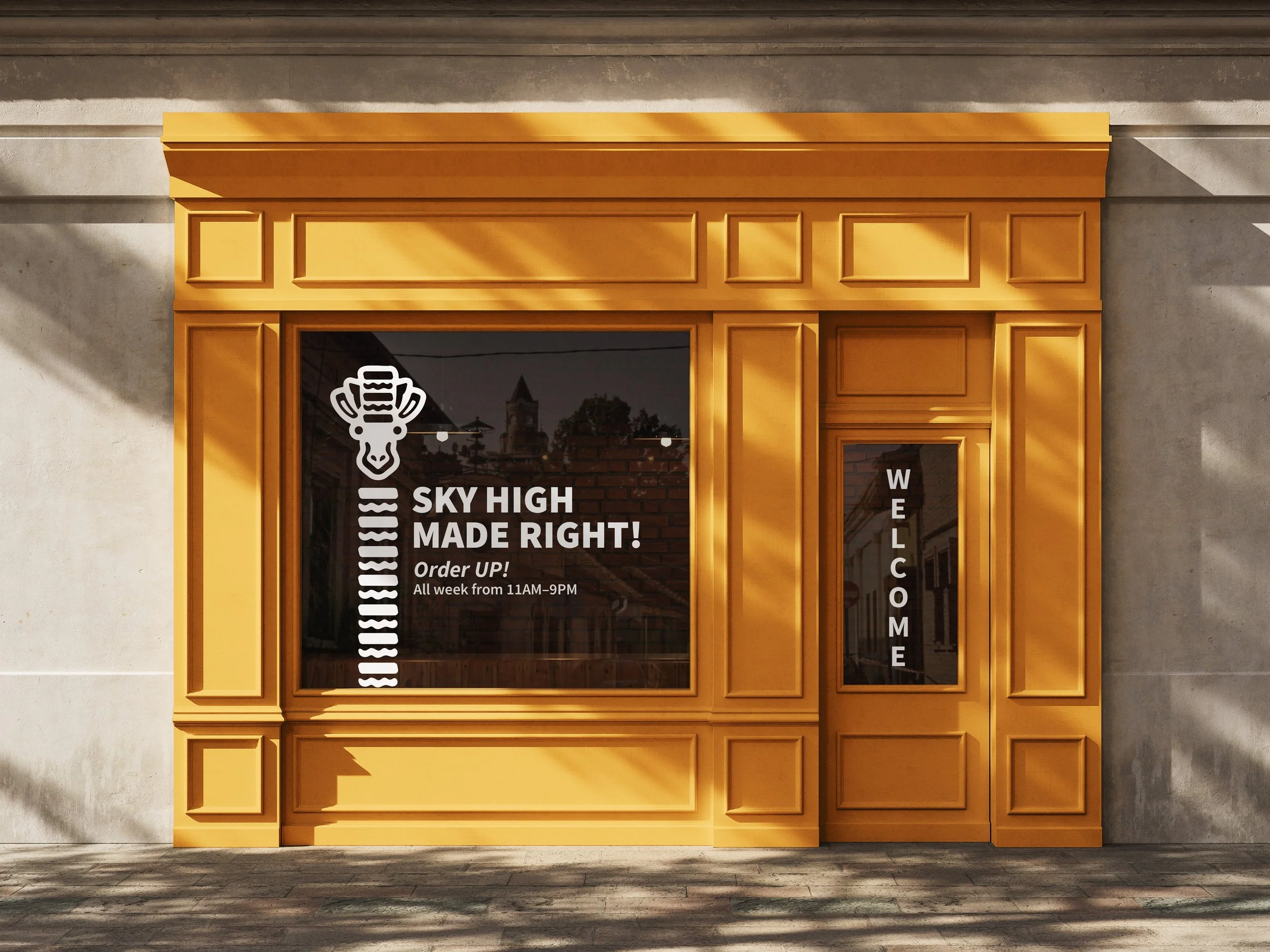
staff apron, sandwich wrap paper, storefront signage.
Tools
Illustrator, Photoshop, Procreate
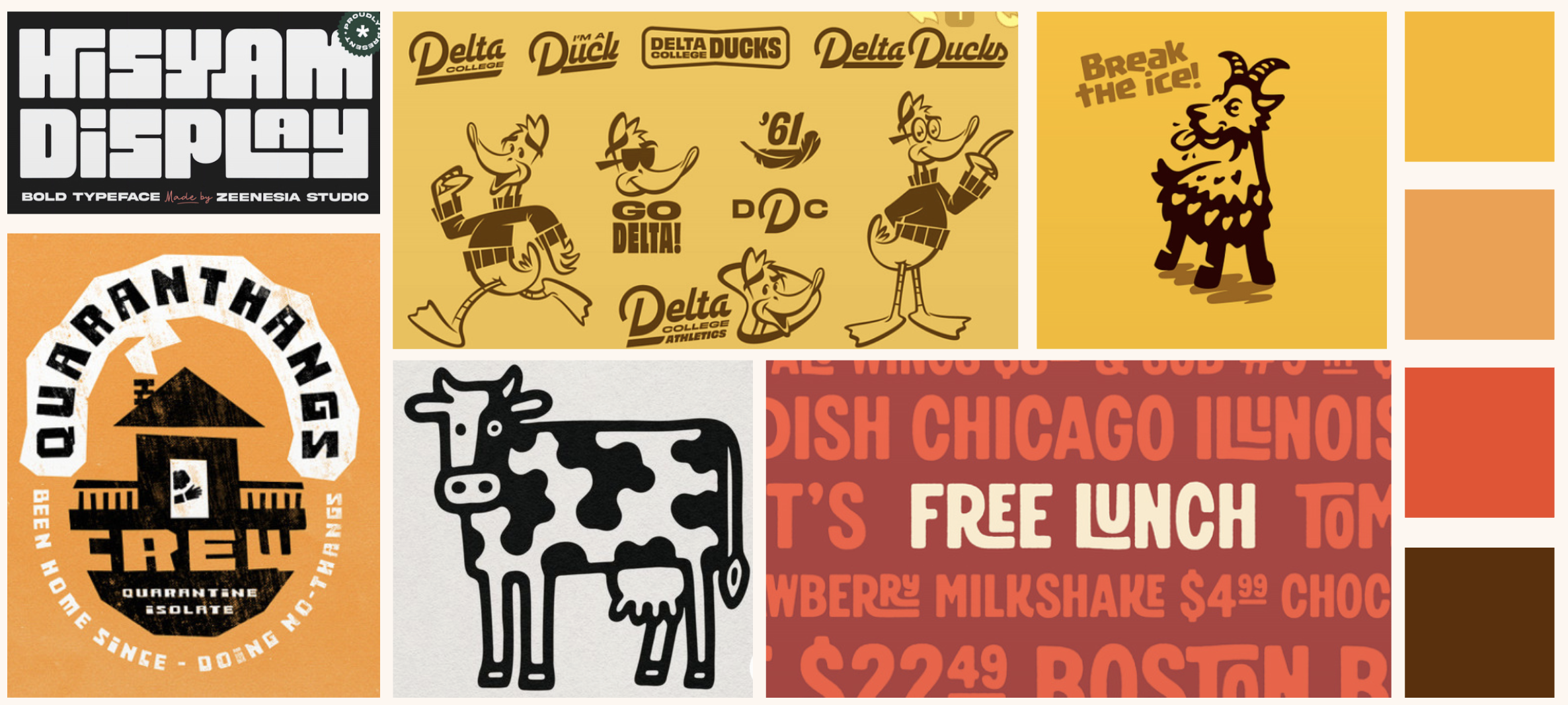
Discovery & Mood Board
Target Audience
Top Tier is designed for families, young adults, and casual diners who love generous portions. It appeals to people who enjoy eating out together, appreciate a sense of fun in their food experience, and want a meal that feels both filling and memorable. The brand’s playful personality and tall sandwiches make it especially attractive to groups looking for something a little out of the ordinary.
Brand Personality
Top Tier’s personality is bold, upbeat, and a little humorous—leaning into the playful charm of its giraffe mascot and the towering height of its sandwiches. The brand embraces vibrant colors, friendly energy, and an atmosphere that feels welcoming and lighthearted. It aims to make the dining experience fun and memorable, encouraging customers to enjoy great food in a setting that doesn’t take itself too seriously.
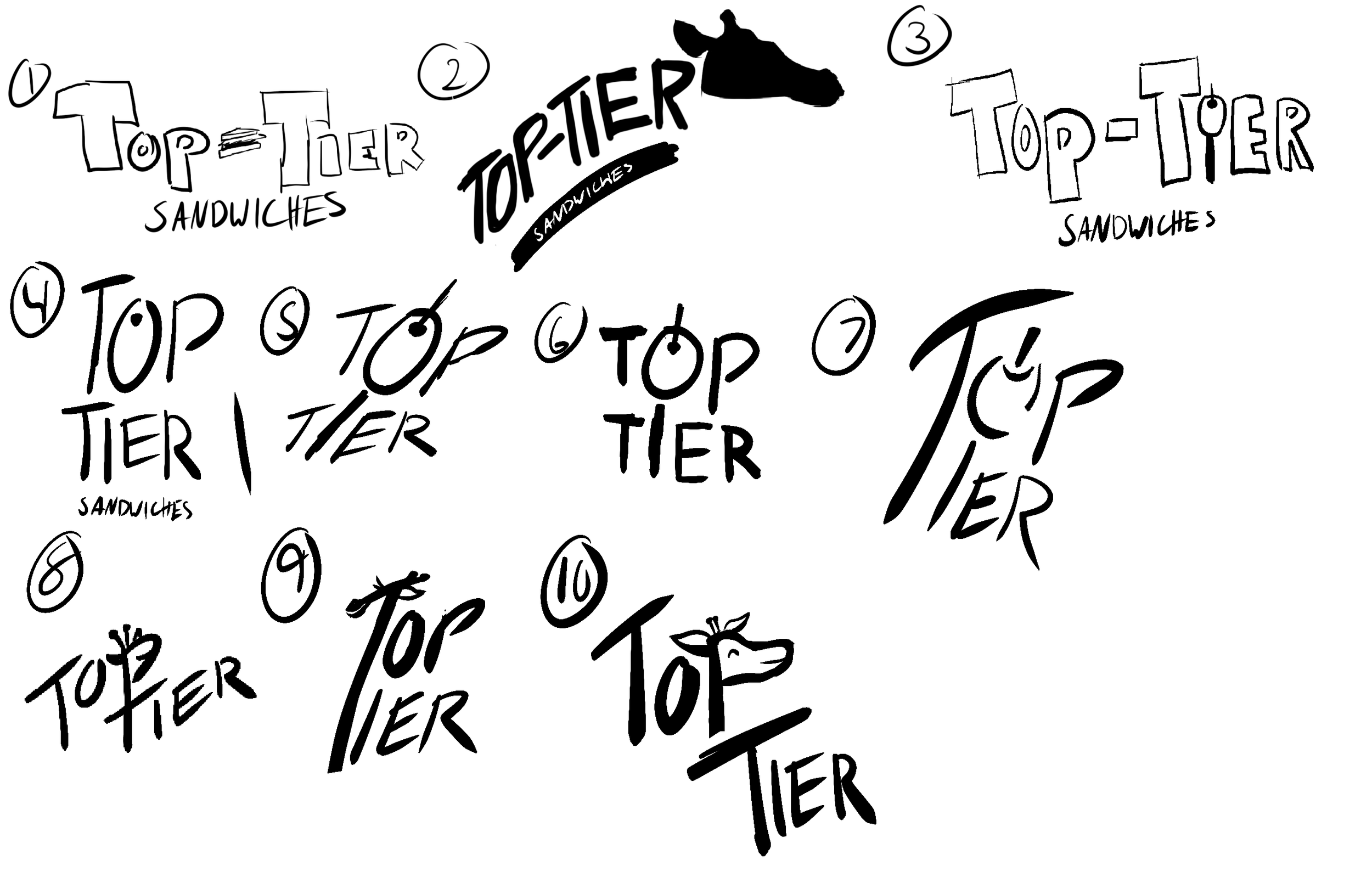
Sketches & Drafts
Challenge & Solution
Challenge
The main challenge in this project was finding a way to combine the giraffe concept with the tall-sandwich idea without making the logo look cluttered or overly complicated. I needed a mark that clearly communicated height and identity while still being simple and recognizable.
Solution
To solve this, I committed to the idea of a giraffe with a sandwich balanced on its head and focused on reducing the design to its simplest form. I began with a detailed giraffe silhouette, then redrew it multiple times, simplifying it into clean, recognizable shapes. This approach helped create a logo that is both playful and clear, making it easy to read at any scale.
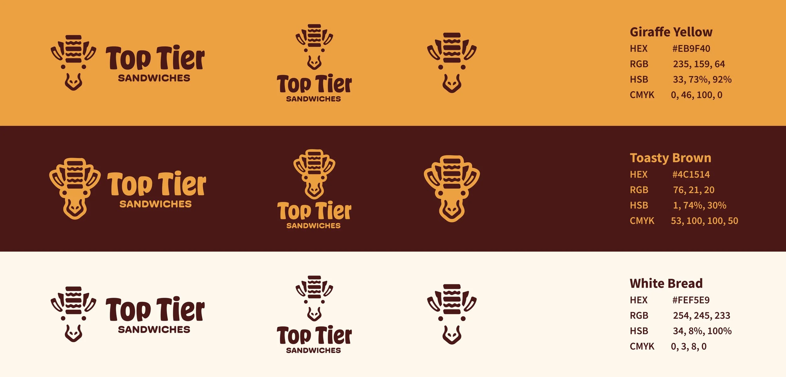
Logo & COlor
Visual Identity Overview
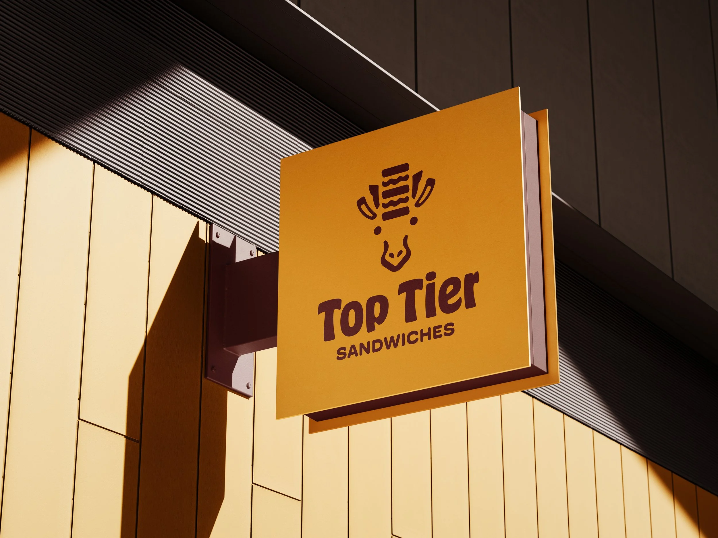
The final logo centers on a simplified giraffe head supporting a stacked sandwich, a clear visual cue for the brand’s signature tall creations. The yellow, brown, and off-white color palette reinforces that connection by pulling directly from both giraffe markings and classic sandwich ingredients. These colors create a warm, inviting look that feels friendly and appetizing, helping the brand stand out while staying cohesive across
all deliverables.



Lessons Learned
Simplicity Takes Time
Simplifying a complex idea into clean, recognizable shapes is harder than it looks. Distilling the giraffe-and-sandwich concept took many rounds of refining and removing details until the design finally felt clear and readable.
Pushing Through Creative Block
I learned that creative block is part of the process, not a sign to start over. I got stuck in the sketching phase for a long time, but pushing through instead of abandoning the concept helped the idea finally click.
Knowing When to Move On
Sometimes you have to move on temporarily instead of forcing a design. Stepping away from the logo and working on other deliverables helped me come back with a clearer mindset, and the solution came together much faster once I wasn’t stuck staring at the same sketch.

