
Mac & Cheese
Summary
This project reimagines Kraft Mac & Cheese with a fresher, more expressive direction that still feels familiar. The goal was to keep the brand’s comforting, nostalgic spirit while giving it a clearer sense of personality and creativity. By leaning into the idea of “making it your own”, the redesign brings new life to the brand without losing what people already associate with Kraft.
Project Type
Brand Shift & Product Packaging
Deliverables
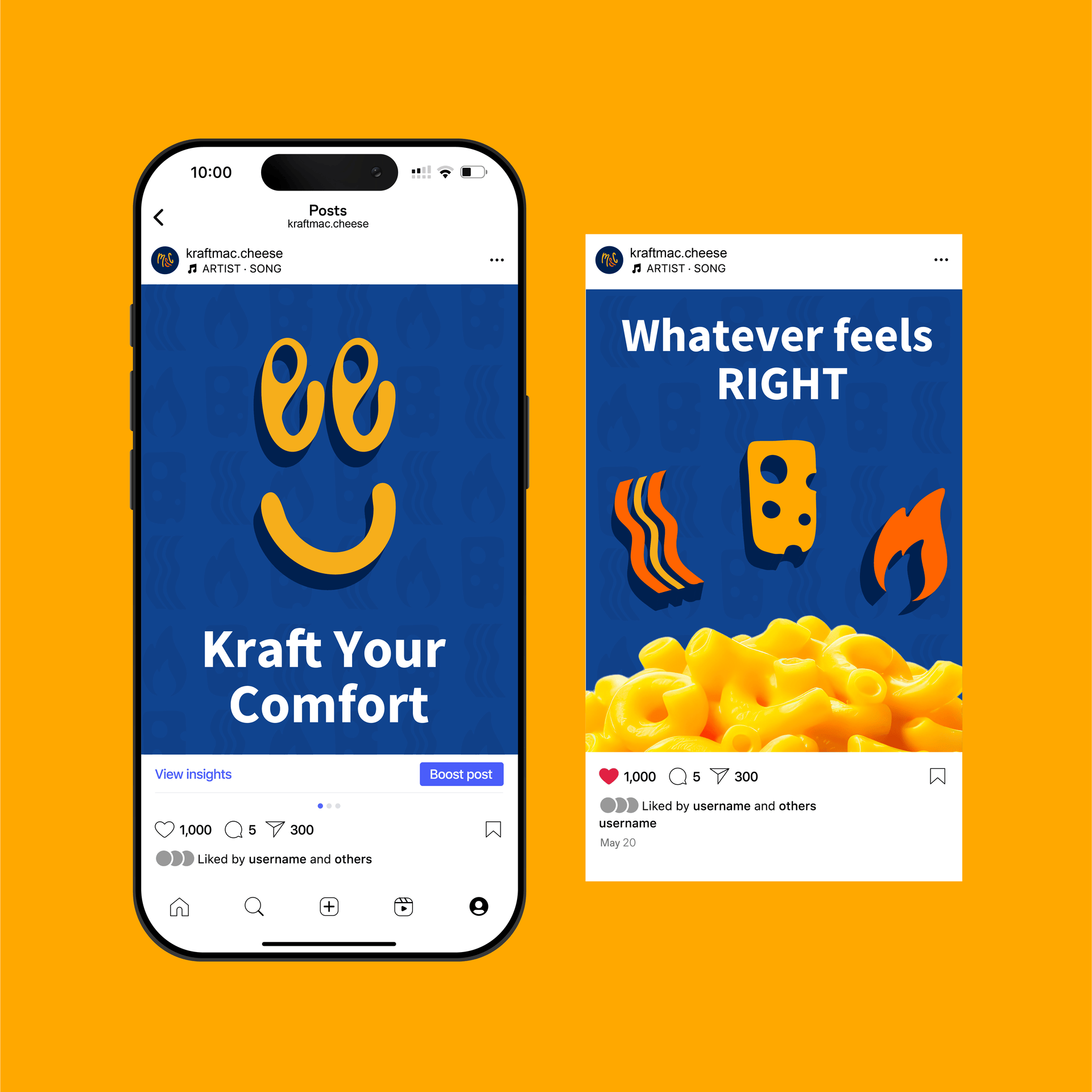
Packaging, Landing Page, Instagram Posts.
Tools
Illustrator, Photoshop, Procreate, Dimension
Visual Audit

Shelf Presence
Kraft stands out because of its deep blue box, which immediately separates it from competitors that use mostly warm colors. Whether placed with other boxed mac and cheese or near ramen in smaller stores, the blue is consistently recognizable and easy to find.
Competitive Context
Many brands in this category lean into being healthier, cheesier, or more gourmet, often using warm colors and similar layouts to support those claims. Kraft, on the other hand, tends to appear as the “standard” or expected option, which makes it recognizable but also a bit predictable. The audit showed that competitors often try to stand out through messaging, while Kraft relies heavily on familiarity, revealing room for a more playful and engaging visual direction.
Discovery & Mood Board

Target Audience
This redesign is aimed at young adults who grew up with Kraft and still see it as a nostalgic comfort food. They enjoy simple meals but also like adding their own twist when they have the time—whether that’s trying a fun recipe, mixing in toppings, or customizing flavors. They appreciate brands that feel familiar yet still encourage a bit of creativity, and Kraft fits naturally into that balance. The goal is to speak to people who want comfort with personality, not just a quick fix.
Brand Direction
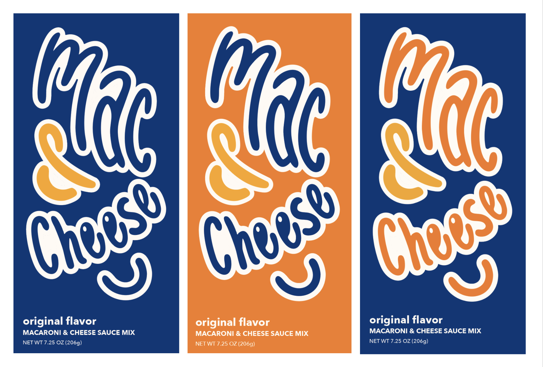
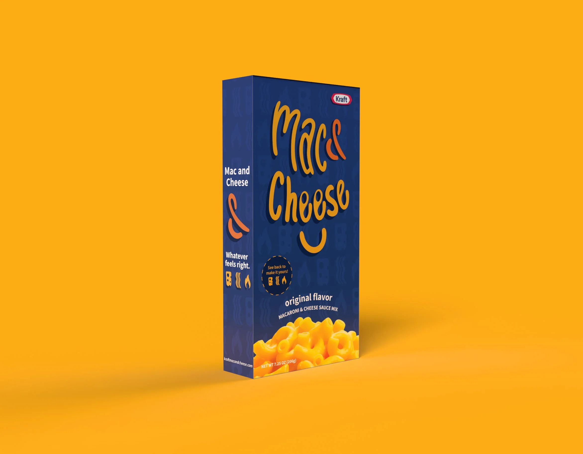
The brand direction focuses on keeping Kraft’s iconic blue so the product still feels instantly recognizable while introducing a more playful, make-it-yours attitude. An idea I was inspired to explore was using a smiley face made from different mix-in ingredients to show how flexible the product can be without changing what people already love about it. It shifts Kraft from being seen as the standard boxed mac and cheese to something fun, flexible, and meant to be personalized.
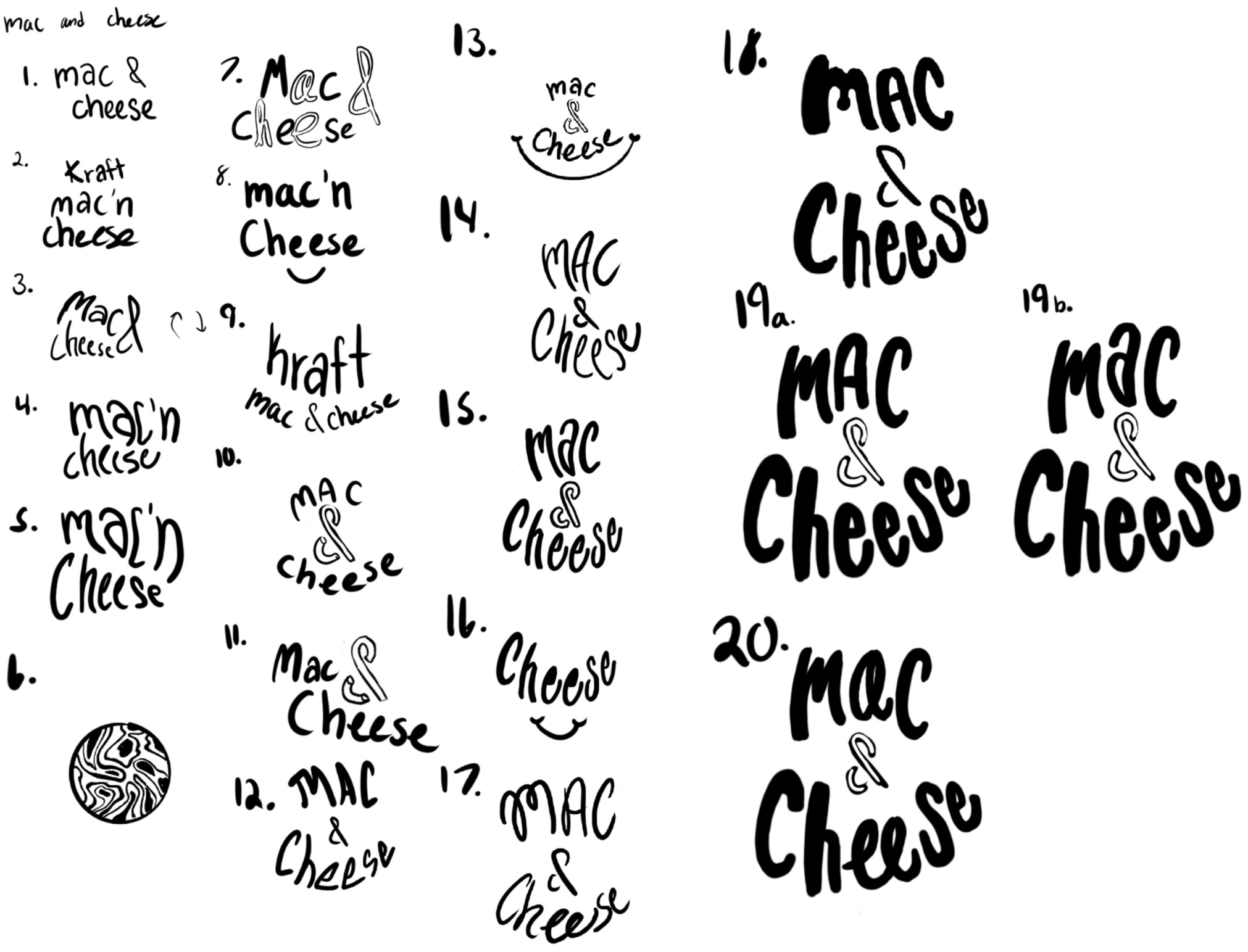
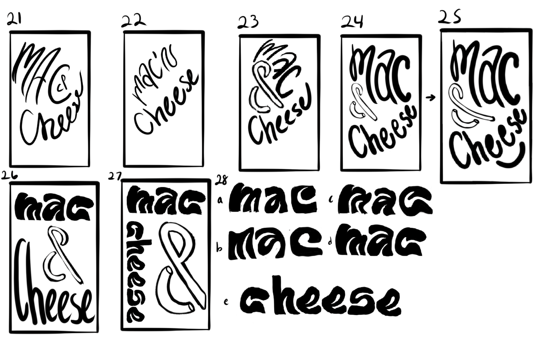
Sketches & Development


Challenge & Solution
Challenge
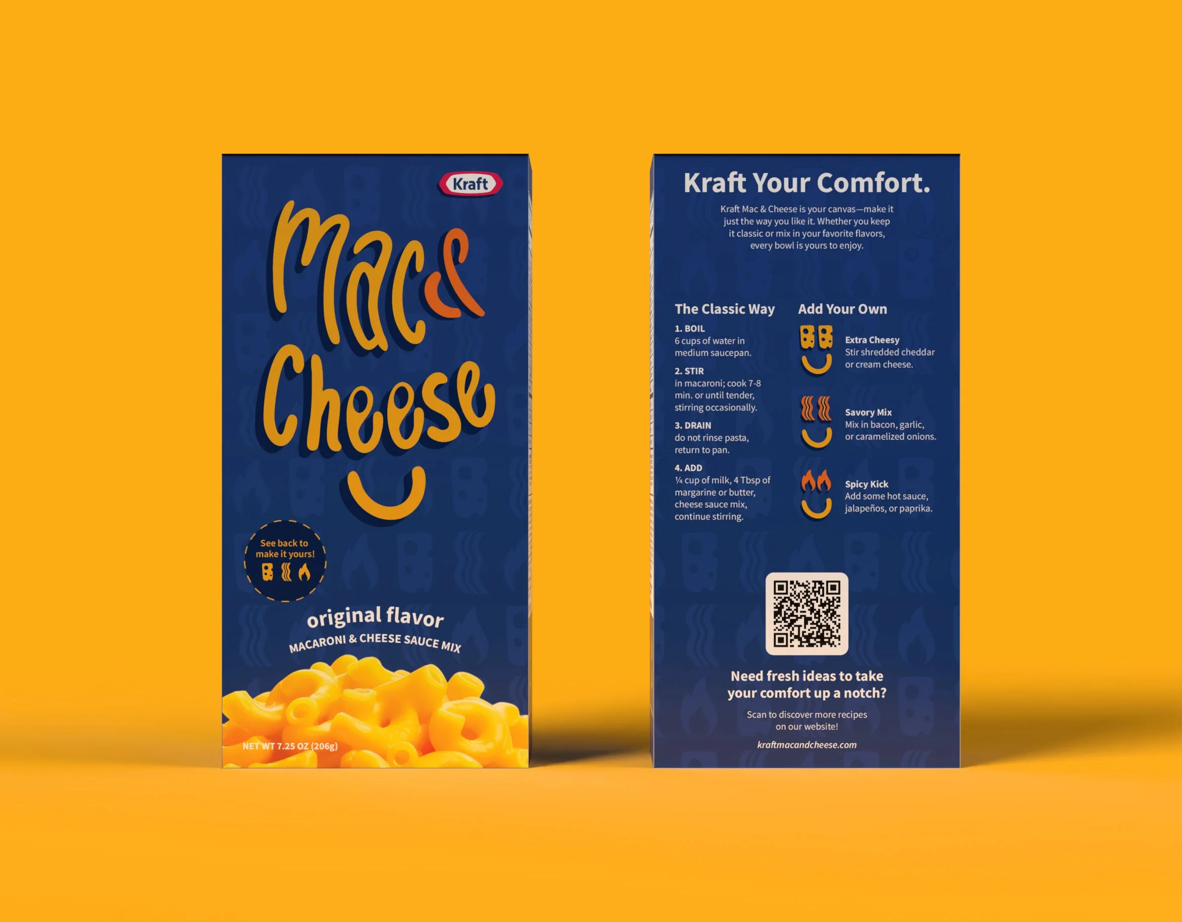
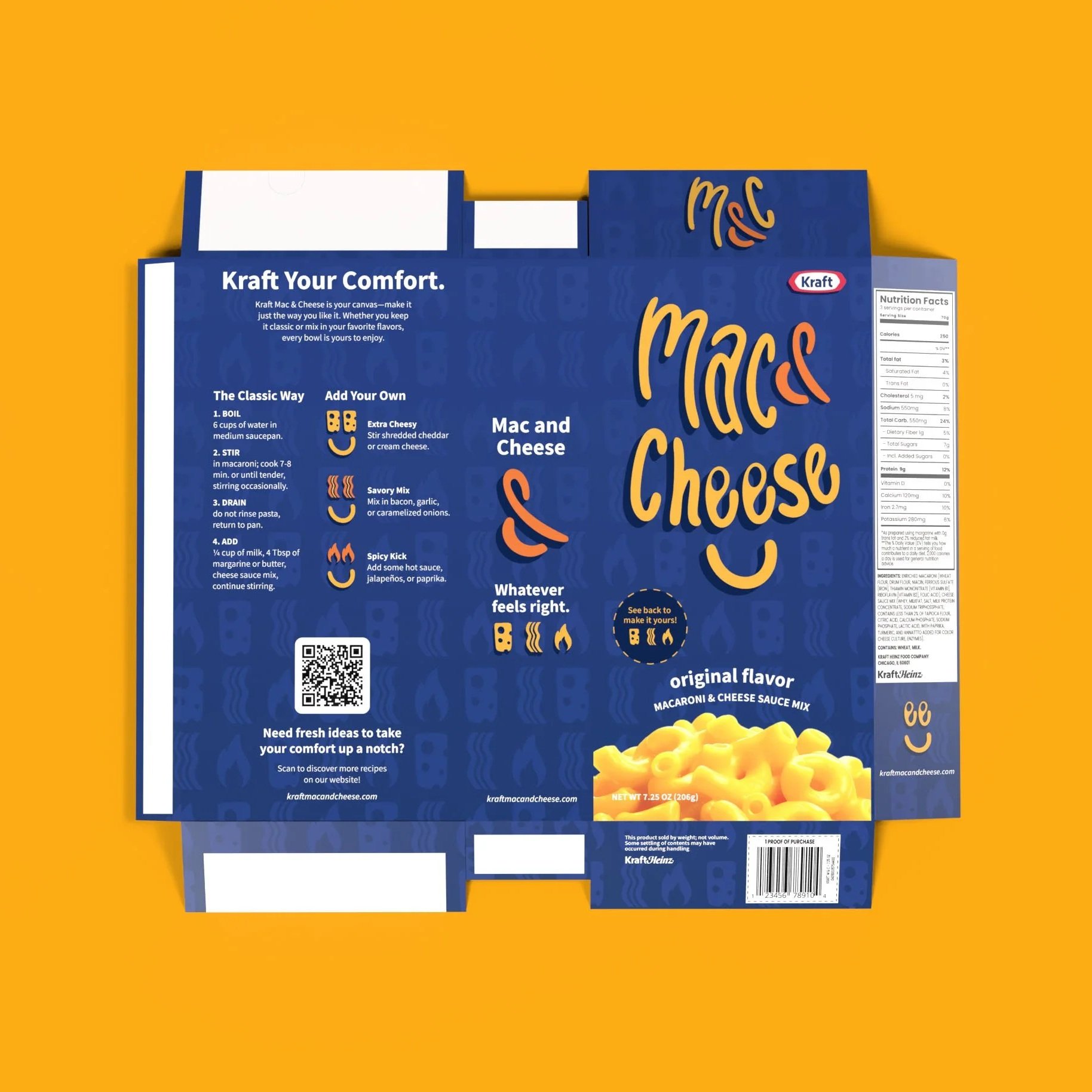
Designing for such a small package format made layout decisions more difficult than expected. Space was limited, yet the box still needed to communicate the instructions, brand story, and a new “add your own twist” idea. Mocking it up added another layer of difficulty—most packaging mockups don’t match Kraft’s slim box size, so creating an accurate 3D version required learning Adobe Dimension and building the mockup from scratch.
Solution
I kept the front of the package clean and direct, adding a simple callout directing customers to the back for more ideas. The back was organized into two clear columns: one for the classic instructions and one offering mix-in suggestions. To support the brand’s push toward inspiration and experimentation, I added a QR code along the bottom linking to recipes on the company’s website. This structure allowed all required information to fit comfortably while still feeling open, approachable, and easy to follow.


Lessons Learned
Seeing the Product in Context
I originally planned to change the box to a bright color like yellow or orange, but once I compared Kraft to other brands on the shelf, it became clear that the blue box was what made it stand out. Viewing the product in its real environment helped me understand why certain elements are worth keeping and how competitive context can completely shift design decisions.
Brand Redirection Requires a Different Mindset
This project pushed me to think differently and dig deeper into what makes a brand itself. Instead of starting from scratch, I had to figure out how to steer Kraft in a new direction while still keeping its core identity recognizable. It taught me the difference between refreshing a brand’s voice and fully reinventing it.
Designing on Small Packaging
Working on a small package format forced me to think more intentionally about hierarchy, clarity, and what actually matters. Fitting instructions, add-in ideas, and a QR code on the back pushed me to prioritize information and design with purpose rather than decoration.