
Avatar Magazine
Summary
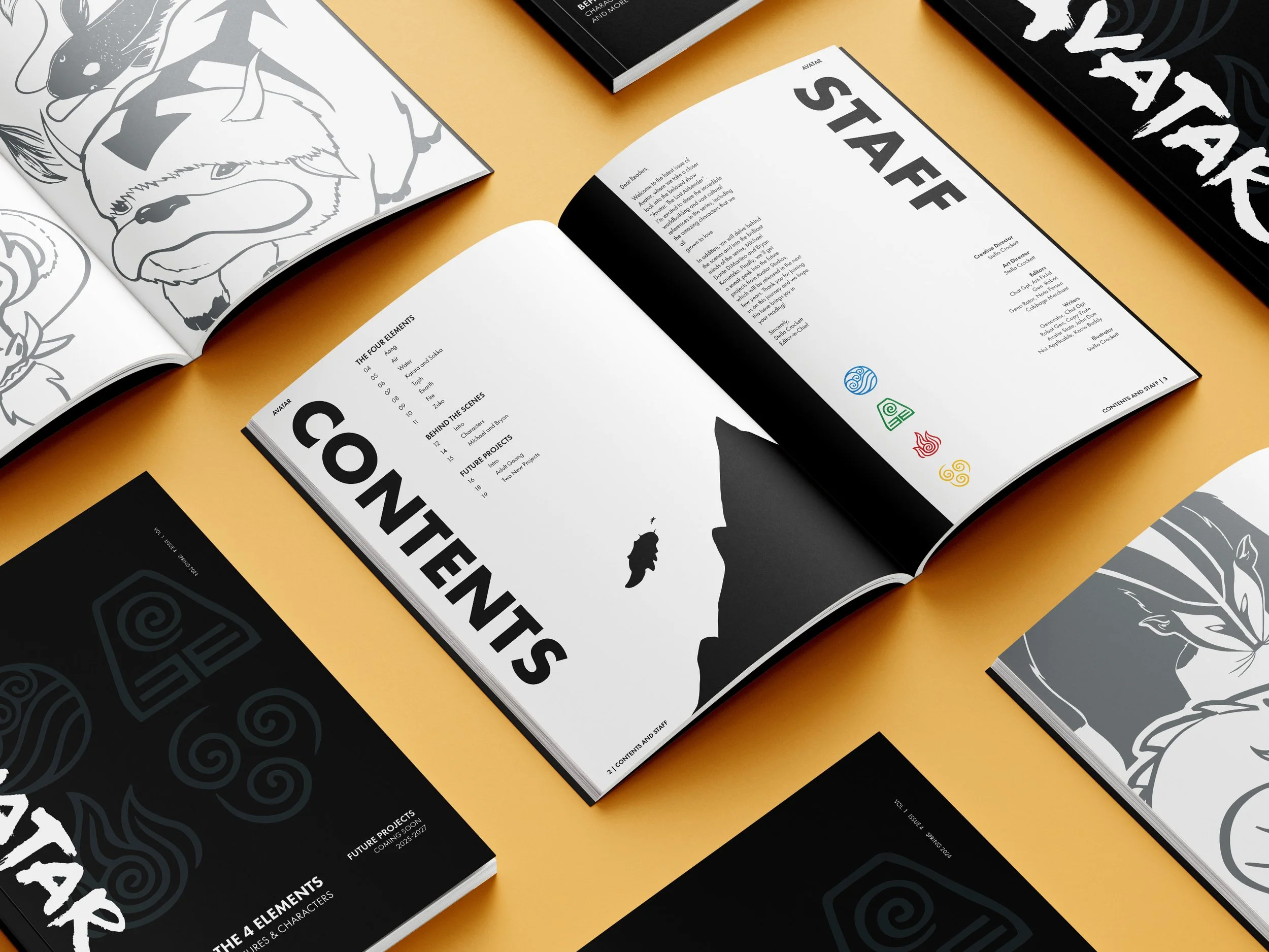
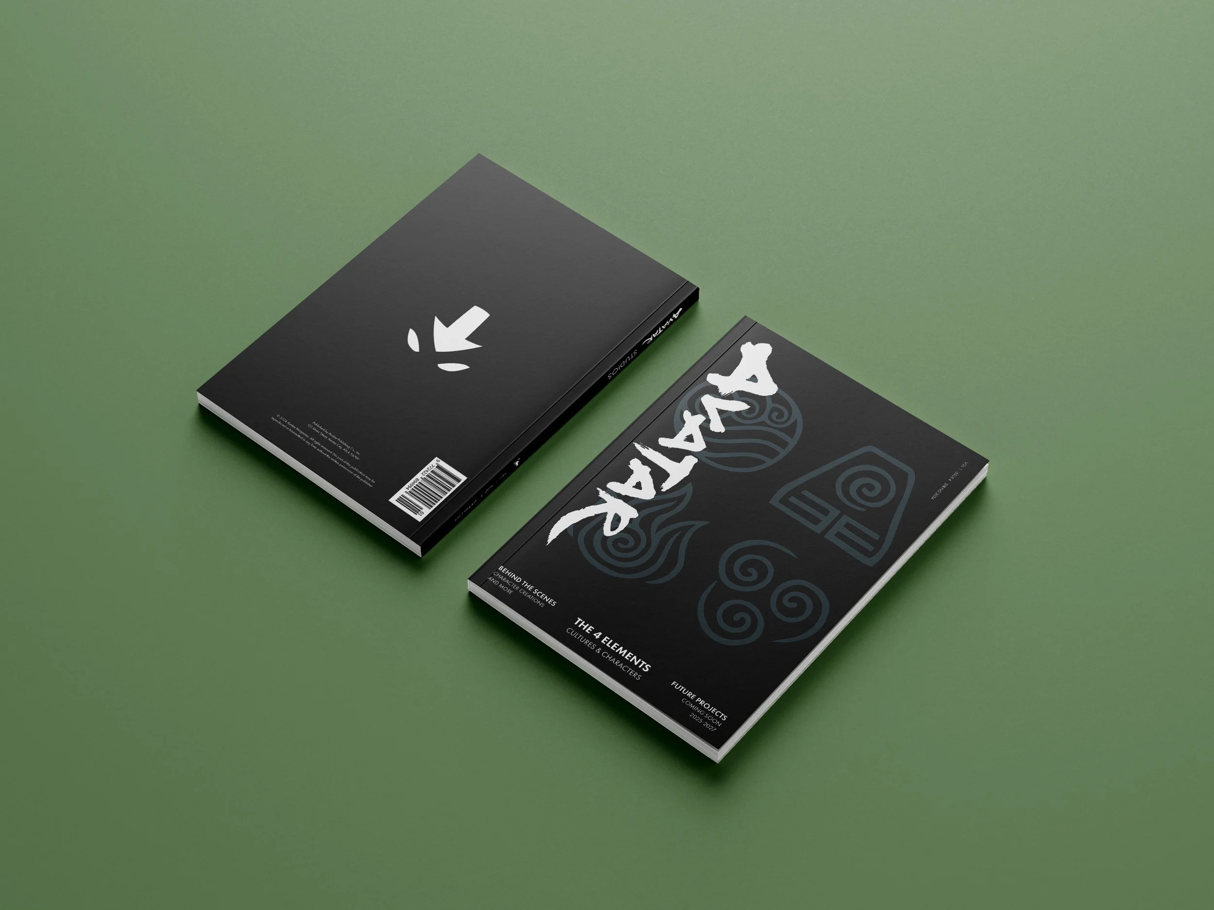
This magazine is on Avatar: The Last Airbender and is designed around the concept of the four elements. My goal was to create a publication that feels organized, visually engaging, and true to the spirit of the series. Each section is defined by a single elemental color and supported by illustrations I created specifically for this project, giving the magazine a cohesive structure while highlighting key aspects of the world.
Project Type
Magazine
Deliverables
24-page magazine
Tools
InDesign, Illustrator, Procreate, Photoshop
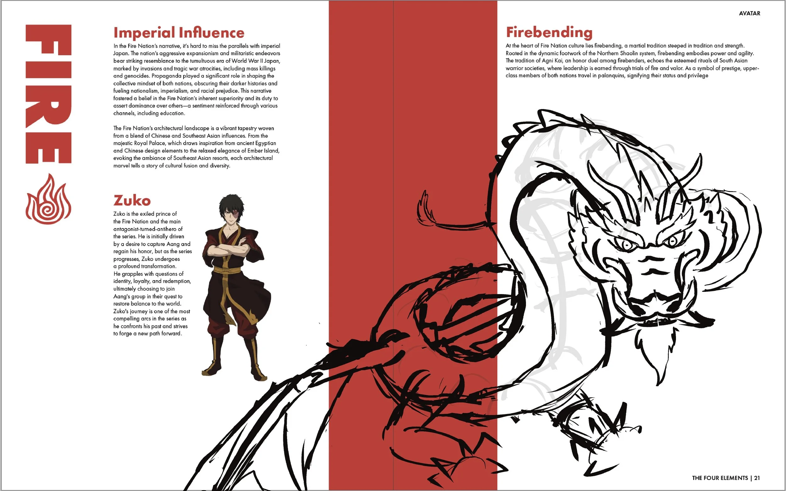
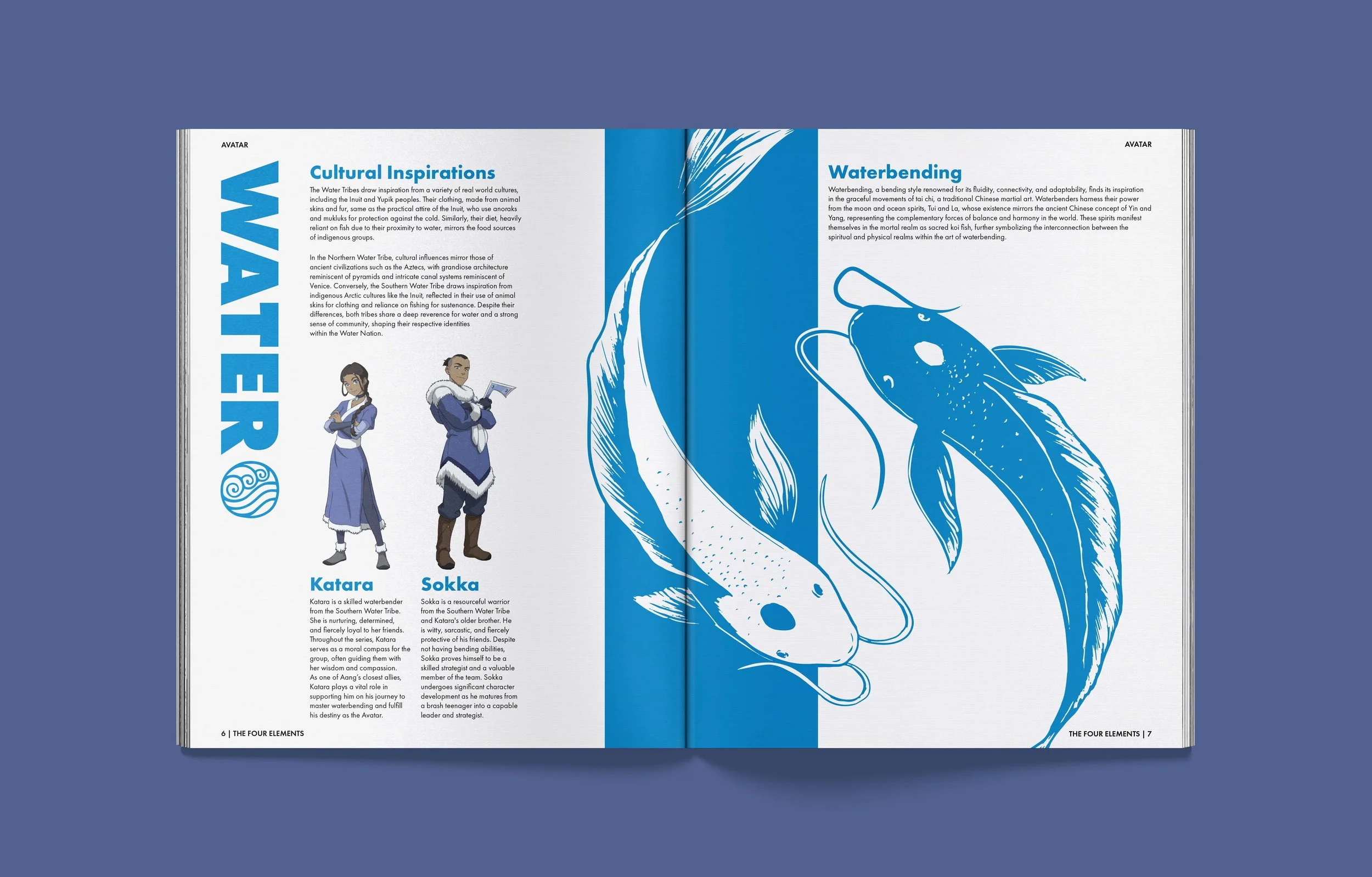
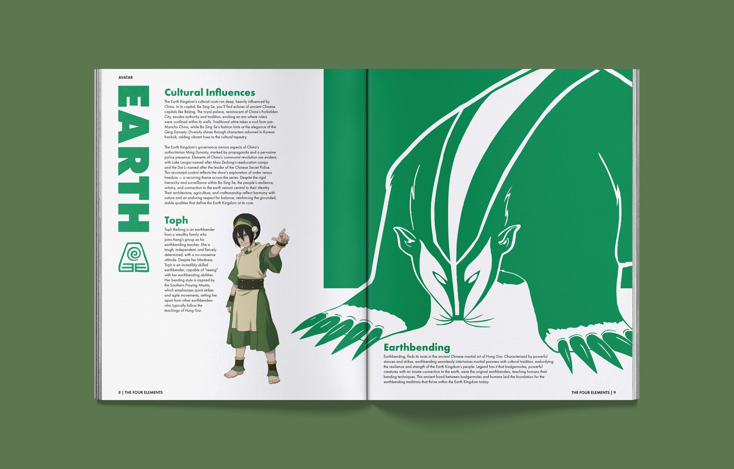
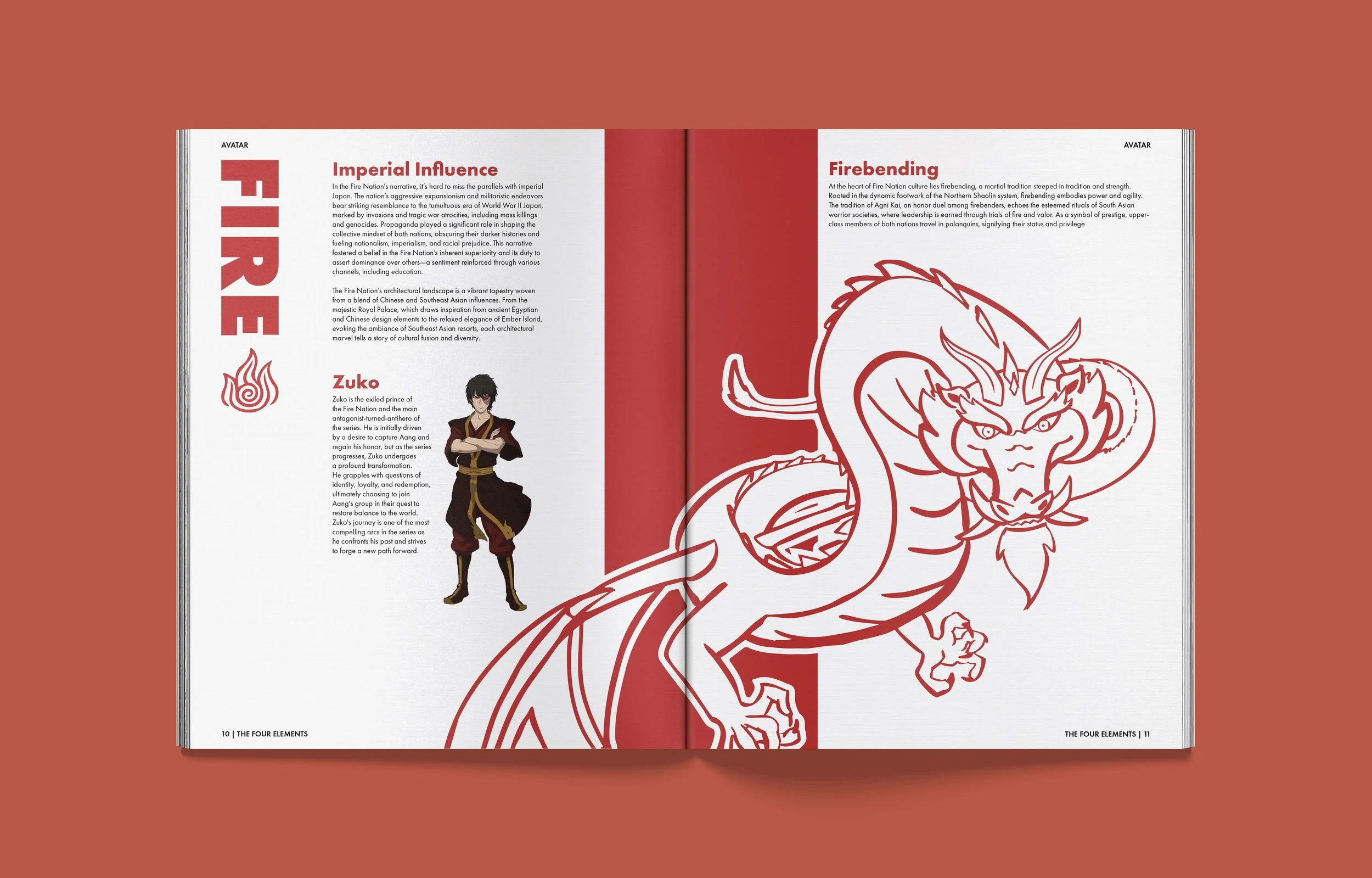
Concept & Inspiration

Color Direction
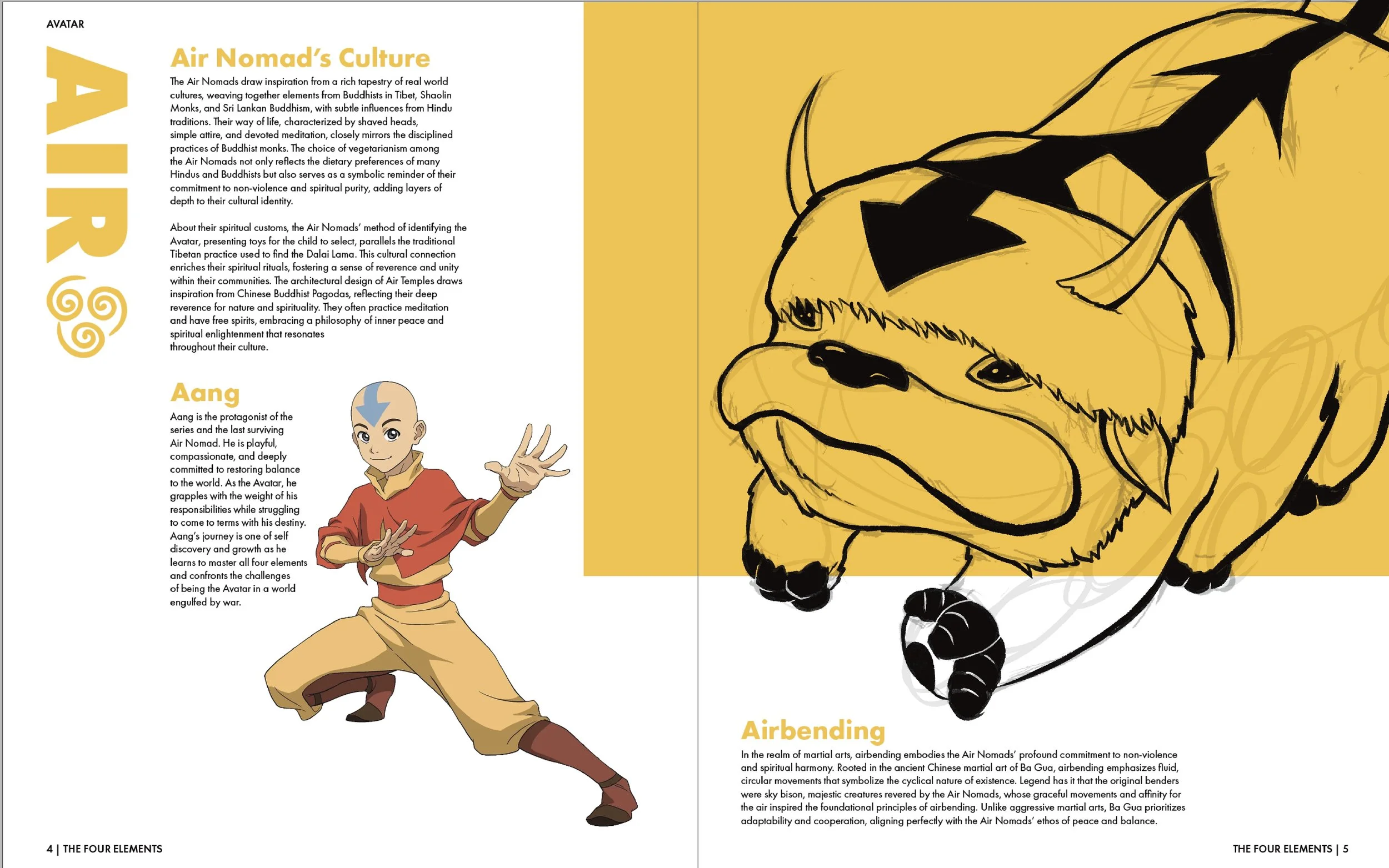
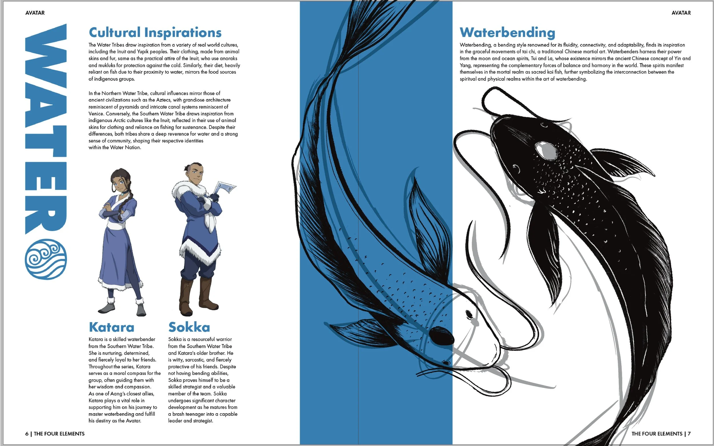
The concept began with using color as the main storytelling tool. Assigning each element its own palette helped the illustrations stand out without overwhelming the layouts. From there, the visual direction grew into a clean, modern editorial style that balances imagery and text while keeping the focus on the elements themselves.
Incorporating Illustration
Because Avatar is an animated series, I wanted the magazine to incorporate hand-drawn illustrations as a way to stay connected to its original medium. Adding my own drawings brought a personal touch to the project and helped break up the cleaner editorial layout with moments of visual interest. It also allowed me to highlight key elements from the show in a simple, stylistic way that supports the overall concept.
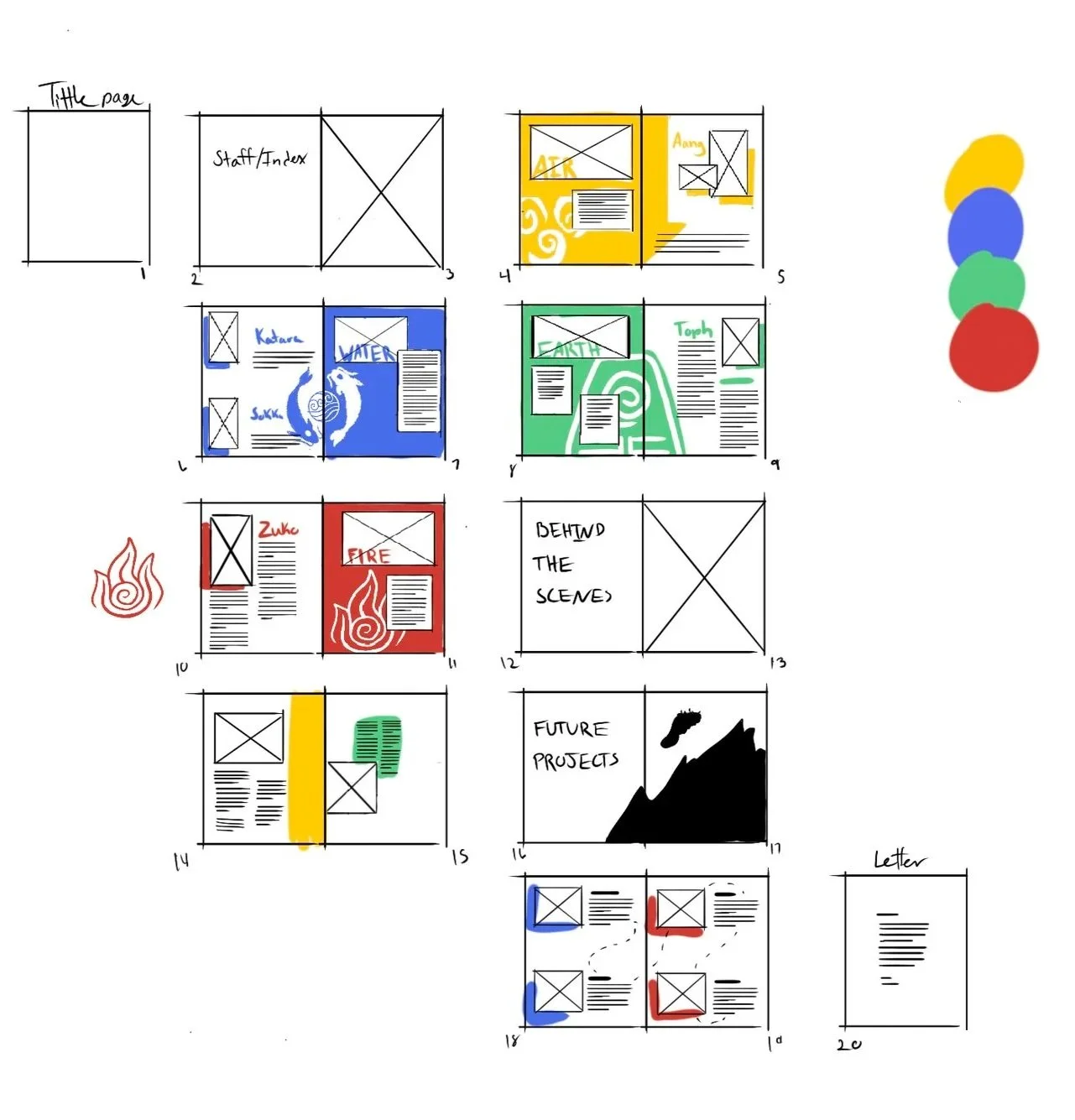
Sketches & Development

Full Magazine

Final Takeaway
Blending Skills
This was the first time I brought my illustration work into an editorial layout, and it pushed me to think differently about hierarchy, composition, and how visuals guide the reader. It taught me how to merge two parts of my skill set in a way that feels intentional and cohesive, and it showed me how illustration can support a story rather than just decorate it.